
SUBEX
Designed digital fraud management system for the web interface of Subex Solutions, a global BSS provider.
My Role
Planned and Executed the complete user experience for PC based stand alone multi-user application for fraud detection.
Tools
Figma, Sketch up, Priniciple, Adobe XD, Zeplin
Duration
March 2020 - June 2020
Communication and Interactions
This project required me to interact with the following stakeholders: Business Analysts, Creative directors, digital fraud investigators.
Company
Moonraft UST Company
Bangalore India
Location
2020 March - 2020 May
When was the last time you got the message for sharing OTP?
.jpeg)
90% of operators are striked by fraudsters on daily basis
Reported by Cybersource.com

That's why Subex exist
Overview
Humanize the process of investigating telecom fraud so that fraud investigation can be combat the fraud in less time and more accuracy?
The problem is that we need specialized experts people to manually code to detect fraud patterns.
This was done for Telecom fraud investigators, that used to be very technical mathematic driven process as they had to manually put together data to find fraud patterns and only experts/ super specialized people did that before. I had to simplify it, the solution had to be humanized enough that can solve the problem.
Excel tool is used for manual fraud detection

Manual fraud linking with thousand of data set could be exhausting and sometimes lose on accuracy.
User's biggest pain point
Before highlighting the process, I would like to highlight the key features
Process
In order to discover and build upon critical user needs, we took diverge approach. Post discovering important artifacts we converged them through affinity mapping into relevant insights and potential opportunities. Again diverging into ideations and conceptualization followed by converging our process in High-Fidelity Mockups.

Double Diamond Design Process
diverge
-
Stakeholder Interview
-
Competitive Analysis
-
Popular Media Scan *
-
Observation
Converge and diverge
-
Synthesis
-
Insights building
-
Identifying Opportunities
-
Low-fidelity conceptulaization
converge
-
Wireframes
-
Visual Design System
-
High - Fidelity Mockup
-
Testing
Observation
People spend lot more time in process of coding, simple graphs to map their data sets. They face challenges in visualizing their data sets links for generation of report. visualizing data values, graphs in order to combat it is sauce to investigate data.
Insights
Visualization is a secret sauce. We should leverage this technique for intuitively and easier discovering fraudulent patterns across multiple data sets at once.
Finalized concept
Following the research phase we dove into ideation and went diverge in yielding multiple concepts to explore. Our ideation process was followed by low - fidelity testing with stakeholders.
Pivot point
Enabling visualization of complex patterns and process.
Opportunities

On further iterations, we could establish the strategy of two key dashboard's in Fraud management system.
1.) "Link analysis" which allows users (coders) to easily integrate 100's of data sets, visualizing the fraud patterns and establishing links in them. (Linking common attributes in data sets to find the pattern)
2.) "ROC View" Dashboard that allows users (BA's) to establish visual graphical report of fraud data sets.
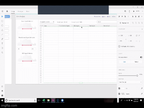
Link analysis: Start by finding patterns
STEP 1: Integrate and onboard data sets on canvas.
Drag & Drop data set
Designing a canvas interaction, where users can easily drag and drop the data sets from left menu. It would help them save time and quick recognition of patterns.
Automate linking
Providing the feature for automate the linking, where system would automatically find necessary pattern and link the data sets. And after linking, they can use clean up for achieving cleaner version. Users could attach visual identity to the important data sets by adding attributes from pallette provided, It would also help them in identifying the grouping patterns.
STEP 2: Assigning degree to linked fraud sets
Assign degree to fraud
Once on degree step, users can add level of degrees to required frauds. They can make use of advanced filters to add an algorithm as well. They can also use simple search to edit specific data. So that it catches the attention.
STEP 3: Visualize and publish the linked fraud
Visualize and Publish
After adding degree, users can visualize the final version of linked data sets in this step. It's all ready to publish and get saved in repository.
Advanced mode
For advanced iterations, providing notes section in the form of left menu. Where users can select particular data set and edit it's key values and dimensions.
And once done users can start it's pipeline of publishing.
Publish your reports and facilitate action on it.
Easily plug in database
The landing page of dashboard presents multiple touch points for users to work on report creation.
Start Visualizing the data sets
Once data is plugged, users can start drawing graphs and charts by switching to next tab Visualization.
Advance mode for coders
In this section users, can draw multiple charts and edit them using advanced filters. This mode is more towards enabling report creation for complex data sets.
Report creation in Dashboard
Once charts are generated, users can create report out of it, in this mode.
Publish the report
In this section users, can draw multiple charts and edit them using advanced filters. This mode is more towards enabling report creation for complex data sets.
Theme for the solution
Dynamic & Flexible
Enhance & accommodate variations in content and compositions.
Seamless & Immersive
The feed should captivate users and provide contextual value - props.
Design System
.png)
Colors used in Link Analysis
Colors used in Link Analysis
.png)
Icons used in Link Analysis
.png)
Text Styles used in Link Analysis
.png)
Icons used in Link Analysis
Impact
Initial test shows that these features were really useful to the user base we tested with. It gave them a sense of trust and guidance at every step of case creation followed by investigation.
We noticed
-
Simplification of fraud linking process led to reduced number of errors during generating linked patters.
-
Significant decrease in Average Time required for Report generation in ROC dashboard
-
Multi-user feature was welcome by most users
-
Artifacts collection, clipboard feature and Investigation closure are still in testing phase but initial trends show a positive impact
Towards the end of this project — we delivered visual design sources files, Invision Prototypes and Angular coded screens to Subex who started integrating front end design to their backend.
Challenges faced
Building new design language
The old design had a lack of hierarchy, dissonant UI, unclear affordances and signifiers in design. The main challenge was to redesign some of the products for consumers who were already accustomed to the old design.
Building to harmonizing the fragmented experience
The process of creating dashboards was very cumbersome and labour intensive. The user flows were fragmented. There were interpretive processes requiring designers to anticipate other stake holder’s needs.
Previous designs
Harmonizing the visual identity
Designing visual design system helped in making the experience consistent